UI Overhaul
Overview
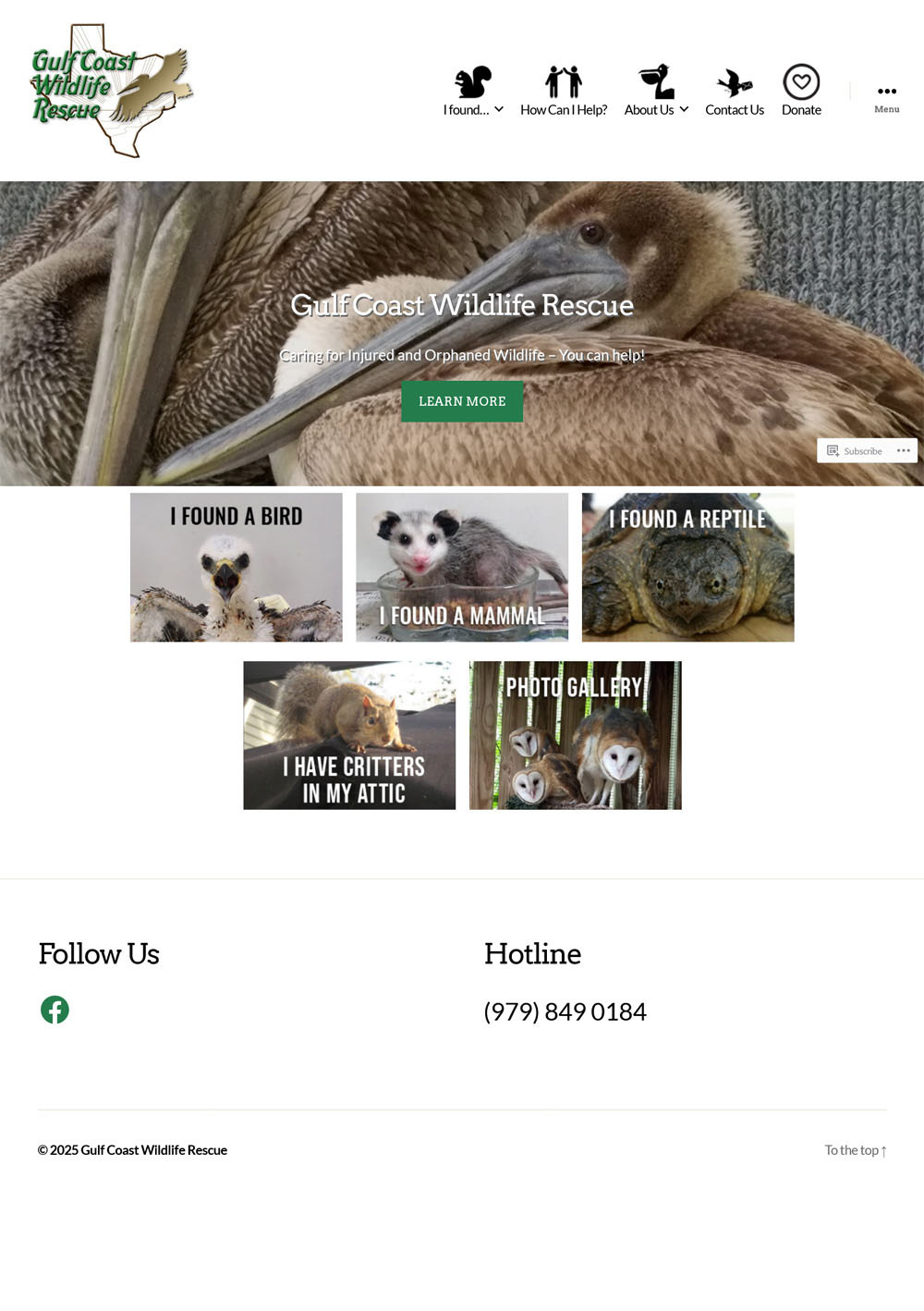
This wildlife rescue’s website needed a refresh to better direct visitors and present information in a more comprehensible format. A complete redesign was not needed, but a number of UX issues needed to be addressed.Original Homepage
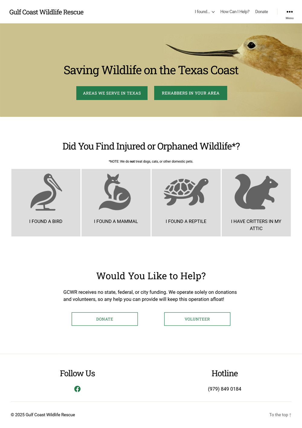
Redesigned Homepage
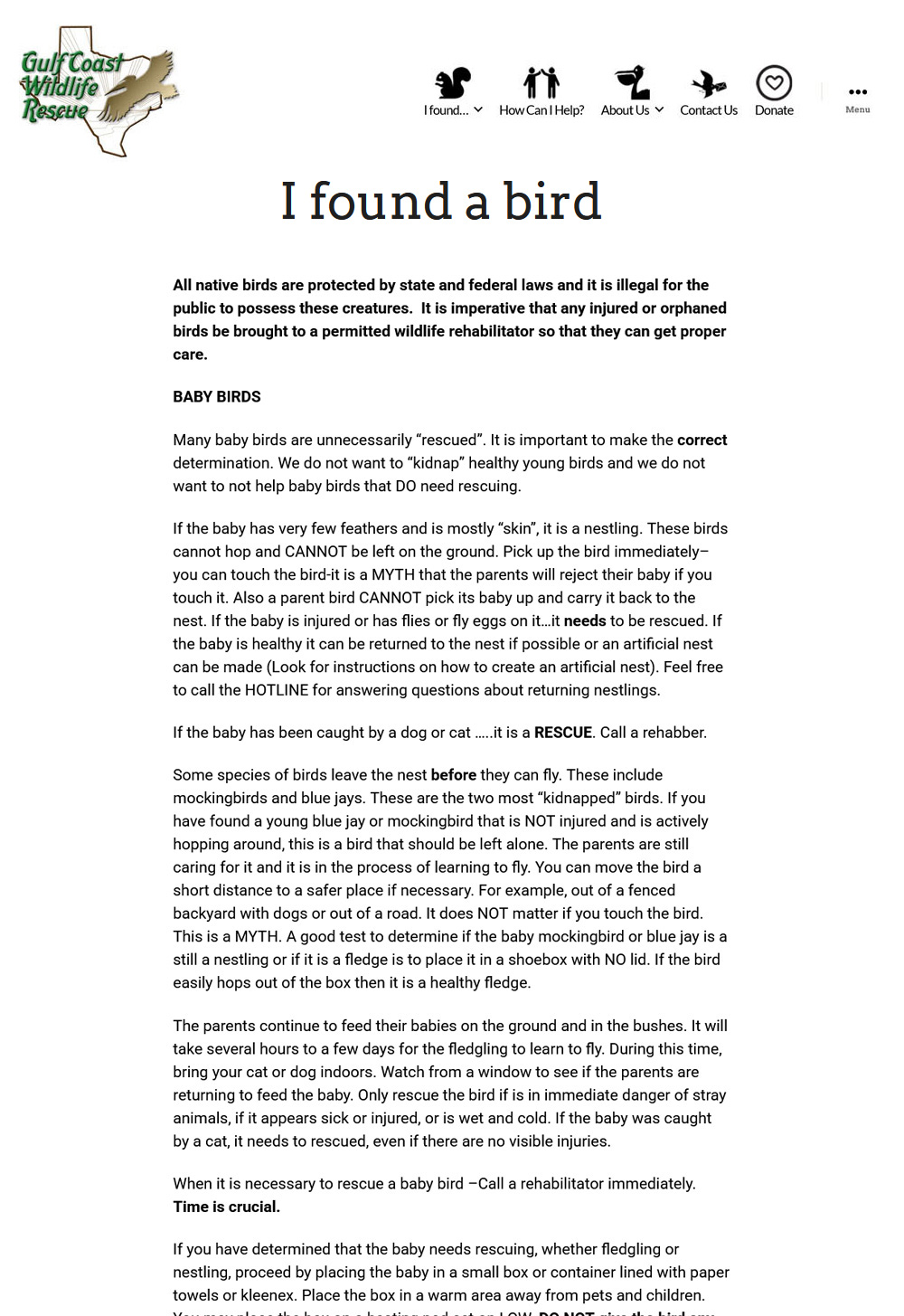
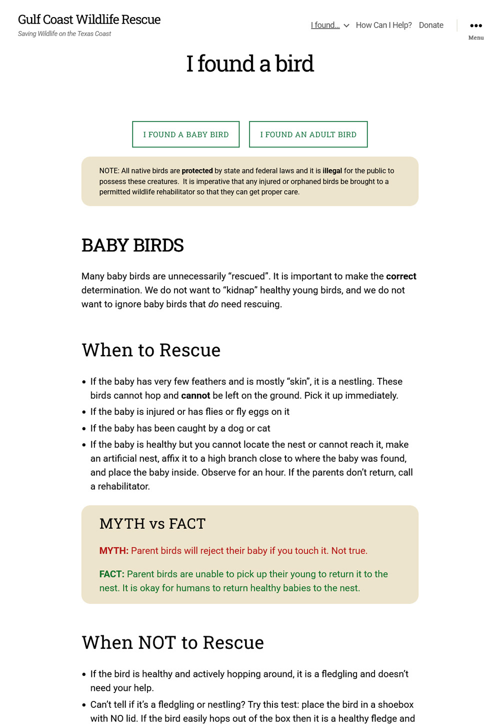
Original Bird Page
Redesigned Bird Page
Challenge
A number of images compete for attention on the homepage, causing visitors to take too long in figuring out where they need to go. Secondary pages also feature large blocks of text, making it more difficult to absorb the important information. The website needs to guide visitors to the following objectives: 1. Assert service areas so only locals contact the organization while directing others to the proper resources; 2. Inform the public about how to rescue injured animals; 3. Solicit donations.
An additional challenge was the inability to install plugins or use javascript since the basic plan on WordPress.com disabled those functionalities.
Process & Insights
I identified the following UI issues:- Unnecessary icons make the main navigation look busy
- There is no “path” for the eye to follow
- The text in the hero banner is not easy to read while drawing too much attention toward a not-so-important area
- The blocks beneath the hero banner compete for attention while also being inconsistent in presentation
- Spacing and font usage are inconsistent
- Pages with a lot of content are hard to look at without eye fatigue
- The Volunteer and Donate pages were scattered with repeating information
All function and styling solutions would need to be addressed via HTML and CSS using the custom HTML and Additional CSS fields.
Solution
- Remove the icons from the main navigation for a cleaner look. Additionally, some of the navigation items are duplicated in the slide-out menu, so the less important links were removed from the visible nav.
- The original logo is busy and looks dated. Since the stakeholder was not attached to it, the logo was replaced with clean text.
- The original hero banner background image drew too much attention away from the content, so it was replaced with a cleaner image that still maintains their animal-first identity.
- When visitors arrive, they need to be funneled first by location, then by purpose. The majority of visitors come to the website because they found an injured animal and need to know what to do next. The home page should therefore direct non-locals to find the correct organization for their area. The rest will be guided to the page that deals with their specific concern.
- Some visitors will also want to help the organization, so guidance is provided as a tertiary action below the animal tiles.
- The homepage is now organized and designed with primary, secondary, and tertiary sections to guide the eye along a desired path.
- On secondary pages, large blocks of text were broken up by headers, with certain important tidbits highlighted in boxes or charts.
- The Volunteer and Donate pages were cleaned up, with redundant information removed and clear instructions provided on how to give time, funds, or supplies.
- Though the orignial logo was outdated, its green and brown(ish) color scheme remained valid, so I retained those color properties since they relay a sense of nature, earthiness, and healing.
Results
“Zoe’s expertise and creativity transformed our site into a user-friendly, engaging platform that perfectly reflects our mission. She streamlined the navigation with clear, logical menus and page structures, making it effortless for visitors to find the information they sought.” — Dana Simon, Founder of GCWRDonations have increased by 15% since the UI overhaul and some visitors have commented on how easy it is now to find the information they need.