
A Case of Too Much Information
Note: As is often the case with small businesses or nonprofits, this organization was eventually dissolved and its domain sold. The website I designed for them is no longer live, so I was unable to get additional screenshots.
Overview
This nonprofit had a bare-bones website based on a basic WordPress template. In a word, it was boring. A complete redesign was in order. The client requested something fresh and eye-catching. Additionally they had pages of content that needed to be added that didn’t make it into the first draft.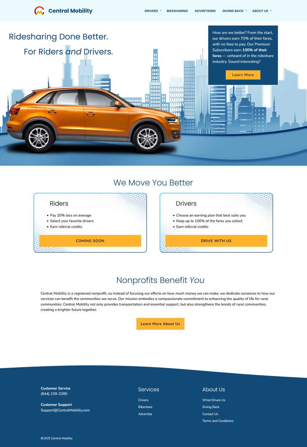
Nothing to See Here

As is often the case with small businesses or nonprofits, this organization was eventually dissolved and its domain sold. The website I designed for them is no longer live, so I was unable to get additional screenshots.
Challenge
Imagine being presented with 12 pages of solid text and then being told it all needs to go into the website… that’s what I faced. How to present all this information in a format that isn’t overwhelming or ugly, hmm…Process & Insights
Since the visual elements of the redesign were fun and fresh, the content needed to not weigh it down with density. There was also the possibility that not all the text was actually needed. Sometimes descriptive, explanatory writeups can be wordy or repetitive. Is it readable? Easy to understand? Perhaps a rewrite was in order instead of using the provided content as is.Solution
I carefully read through each piece of content to comprehend its purpose and what it was trying to convey. It turned out that there was a lot of unnecessary text, with similar concepts being repeated in different ways. With my writing background, I was able to streamline the text into readily understandable concepts, broken up into bite-sized paragraphs, each with its own sub-heading that acted as a preview of the proceeding content.Results
“The website looks so good! The last designer we hired spent four months to come up with that boring thing. It’s incredible what you accomplished in two weeks.” — Steven Carter, Director of Operations at Central MobilityThough I’m unable to show you the content pages that resulted from my efforts to break up the large blocks of text, I can at least tell you that the client was impressed with the results and loved how I presented the information. The purpose of the original text came across and was easy to understand without having to spend all day reading.